Lifting charged bookings by 28.7% through a reimagined slot booking experience
Lifting charged bookings by 28.7% through a reimagined slot booking experience
How redesigning the decision making moment helped more users complete the bookings they actually wanted, lifting online GTV from ₹42L to ₹50L per month within 2 months of launch.
How redesigning the decision making moment helped more users complete the bookings they actually wanted, lifting online GTV from ₹42L to ₹50L per month within 2 months of launch.
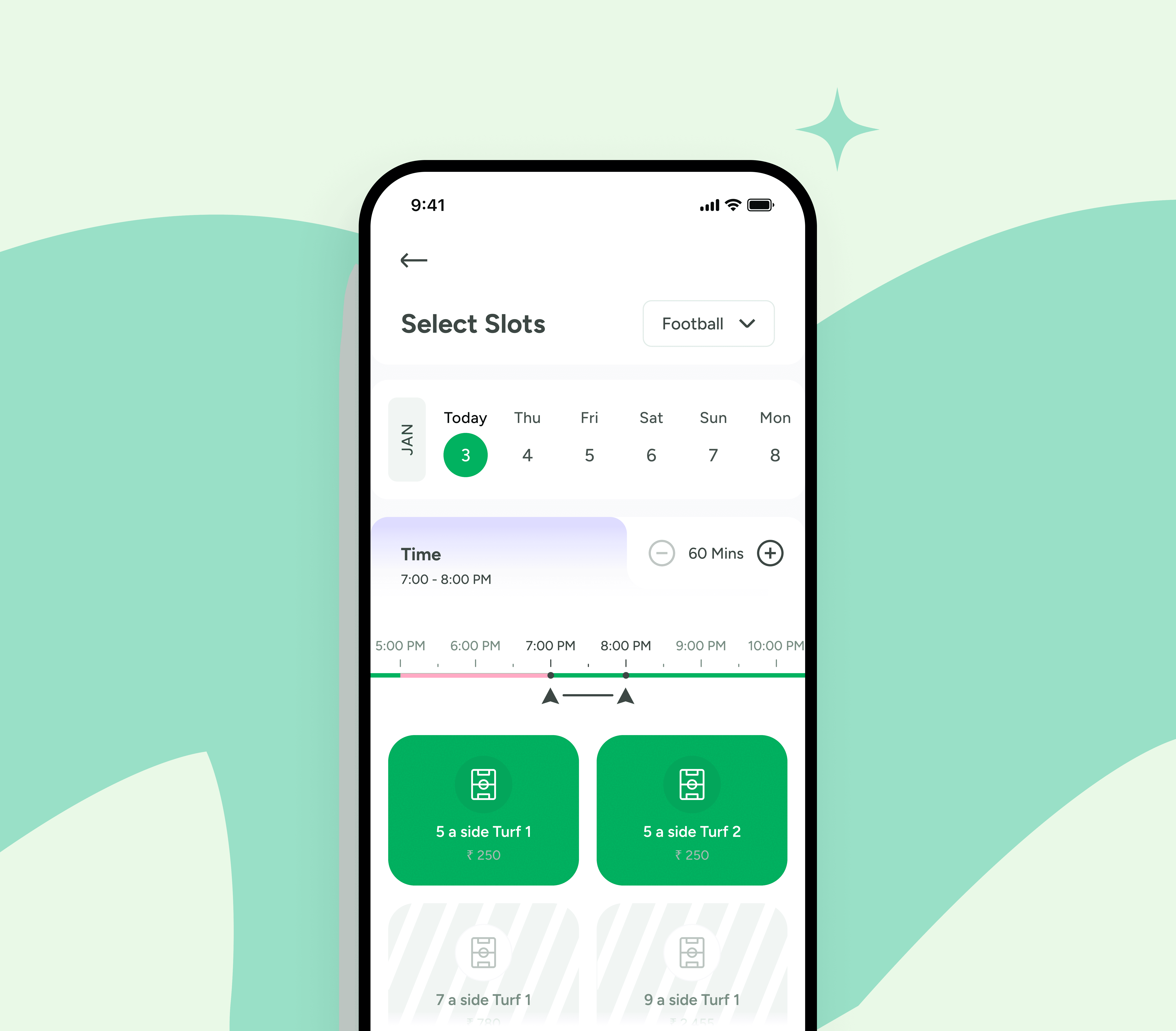
The Impact
Headline outcomes within 4 weeks of launch, validated through A/B testing
Headline outcomes within 4 weeks of launch, validated through A/B testing
→
Monthly online GTV
Monthly online GTV
Charged conversion lift
Charged conversion lift
Transacting users
Transacting users
Loyalty redemption
Loyalty redemption
My Role
My Role
Led the redesign end-to-end as Sr. Product Designer. I owned funnel analysis synthesis, all design exploration and final UI, and stakeholder alignment with engineering and ops. Cancellation metrics were tracked in collaboration with the data analytics team post-launch
Led the redesign end-to-end as Sr. Product Designer. I owned funnel analysis synthesis, all design exploration and final UI, and stakeholder alignment with engineering and ops. Cancellation metrics were tracked in collaboration with the data analytics team post-launch
Team
1 Product Head
1 Product Head
2 Designers
2 Designers
4 Mobile Devs
4 Mobile Devs
4 Backend Devs
4 Backend Devs
4 QAs
4 QAs
Timeline
2 Months
2 Months
Platform
Android & IOS
Android & IOS
Context
Context
Playo is the world's largest sports community — a platform where millions of people book venues, find trainers, and join games nearby.
Playo is the world's largest sports community — a platform where millions of people book venues, find trainers, and join games nearby.
Over the years, Playo has been recognized by Google as:
Over the years, Playo has been recognized by Google as:
Best App of the Year (2018)
Best App of the Year (2018)
Inspiring Indian App of the Year (2023)
Inspiring Indian App of the
Year (2023)
At this scale, a small friction point can quietly snowball into thousands of failed bookings every single day. This case study looks at how smoothing out one such friction made a measurable business difference.
At this scale, a small friction point can quietly snowball into thousands of failed bookings every single day. This case study looks at how smoothing out one such friction made a measurable business difference.
The Problem That Was Quietly Breaking Trust
The Problem That Was Quietly Breaking Trust
The Slot Booking screen is the moment of truth. It's where a user picks a date, time, duration, and court before committing to a booking. Think of it as the decision cockpit. If anything here feels off, the user either bails out, or pushes through with hesitation that surfaces later in the funnel.
The Slot Booking screen is the moment of truth. It's where a user picks a date, time, duration, and court before committing to a booking. Think of it as the decision cockpit. If anything here feels off, the user either bails out, or pushes through with hesitation that surfaces later in the funnel.
And the signal was hard to ignore. The funnel showed massive bleed at the bottom — users adding to cart and viewing checkout, then quietly walking away before paying. Hosts were frustrated. Our ops team was fielding the same complaints on repeat. It wasn't dramatic, no crashes, no outages — but the slow, steady bleed of confusion was costing us real bookings and real trust.
By the numbers (pre-redesign baseline)
By the numbers (pre-redesign baseline)
Translating UX pain into business cost is what made this a P0, not a polish task:
Translating UX pain into business cost is what made this a P0, not a polish task:
Charged conversion was only 32.77% — meaning two out of three users entering the booking flow never completed a paid booking
Charged conversion was only 32.77% — meaning two out of three users entering the booking flow never completed a paid booking
Drop-off was concentrated in the View Checkout → Charged step: a 28+ percentage point gap between users intending to pay and users actually completing
Drop-off was concentrated in the View Checkout → Charged step: a 28+ percentage point gap between users intending to pay and users actually completing
Karma Points and venue coupons were issued but rarely redeemed — a loyalty mechanic running idle
Karma Points and venue coupons were issued but rarely redeemed — a loyalty mechanic running idle
Qualitative signal was strong: users emailing in confused about times, hosts and ops team flagging the same booking-flow issues repeatedly
Qualitative signal was strong: users emailing in confused about times, hosts and ops team flagging the same booking-flow issues repeatedly
Understanding the Damage
Understanding the Damage
Before jumping into solutions, we went back to basics: what are users actually experiencing?
Before jumping into solutions, we went back to basics: what are users actually experiencing?
We gathered insights from four sources: user emails and complaints, conversations with venue hosts, ops team feedback, and a detailed funnel analysis of drop-offs across the Venue → Slot → Checkout → Payment journey.
We gathered insights from four sources: user emails and complaints, conversations with venue hosts, ops team feedback, and a detailed funnel analysis of drop-offs across the Venue → Slot → Checkout → Payment journey.
The pattern was clear. Here's what the data and feedback kept circling back to:
The pattern was clear. Here's what the data and feedback kept circling back to:
Users were dropping at the same handful of decision moments, especially time and duration
Users were dropping at the same handful of decision moments, especially time and duration
Duration vs. actual end time was confusing — users couldn't tell when their session would end
Duration vs. actual end time was confusing — users couldn't tell when their session would end
The final-step funnel gap (View Checkout → Charged) was abnormally large, signaling friction at the moment of commitment
The final-step funnel gap (View Checkout → Charged) was abnormally large, signaling friction at the moment of commitment
The tech was outdated and hard to modify — making even small fixes painful
The tech was outdated and hard to modify — making even small fixes painful
The screen felt heavy and overwhelming — too much information, not enough clarity
The screen felt heavy and overwhelming — too much information, not enough clarity
Why This, Why Now
Why This, Why Now
This wasn't just a design cleanup. The problems had compound effects. Friction at the slot stage wasn't just a UX failure — it was costing us paid bookings, suppressing repeat use, and leaving loyalty value on the table.
This wasn't just a design cleanup. The problems had compound effects. Friction at the slot stage wasn't just a UX failure — it was costing us paid bookings, suppressing repeat use, and leaving loyalty value on the table.
We decided to redesign because we wanted to:
We decided to redesign because we wanted to:
Make booking clearer and more intuitive
Make booking clearer and more intuitive
Lift charged conversion at the bottom of the funnel
Lift charged conversion at the bottom of the funnel
Lower the cognitive load of calculating times
Lower the cognitive load of calculating times
Activate loyalty mechanics that were sitting unused
Activate loyalty mechanics that were sitting unused
Refresh the visuals to match our updated design system
Refresh the visuals to match our updated design system
The Questions That Shaped Everything
The Questions That Shaped Everything
Before a single wireframe was drawn, we anchored ourselves to four honest design questions. Every design decision had to trace back to at least one of these.
Before a single wireframe was drawn, we anchored ourselves to four honest design questions. Every design decision had to trace back to at least one of these.
01
PROBLEM FRAMING
What are we truly solving?
Not just what looks broken — but what's actually breaking users' trust.
01
PROBLEM FRAMING
What are we truly solving?
Not just what looks broken — but what's actually breaking users' trust.
01
PROBLEM FRAMING
What are we truly solving?
Not just what looks broken — but what's actually breaking users' trust.
02
USER FRICTION
Where are users struggling the most?
Time and duration stood out clearly from the research.
02
USER FRICTION
Where are users struggling the most?
Time and duration stood out clearly from the research.
03
URGENCY
Why change this now?
Because the cost of not changing it was getting higher every week.
03
URGENCY
Why change this now?
Because the cost of not changing it was getting higher every week.
04
BUSINESS IMPACT
How will this help the business?
Fewer drop-offs = more completed bookings = more revenue, more repeat users, and more active loyalty redemption.
04
BUSINESS IMPACT
How will this help the business?
Fewer drop-offs = more completed bookings = more revenue, more repeat users, and more active loyalty redemption.
Diagnosing the Pain Points
Diagnosing the Pain Points
Once we put the old screen under a microscope, the specific problems became painfully obvious. We broke each one down screen-by-screen so we could quantify the cost of each friction.
Once we put the old screen under a microscope, the specific problems became painfully obvious. We broke each one down screen-by-screen so we could quantify the cost of each friction.
Time Selector
Time Selector
32%
32%
of users adjusted slot 3+ times
of users adjusted slot 3+ times
47%
47%
couldn't tell when session ended
couldn't tell when session ended
High
drop-off before checkout
1 pointer
for both start AND end
High
drop-off before checkout
1 pointer
for both start AND end
High
drop-off before checkout
1 pointer
for both start AND end
OBSERVED ISSUES
A single pointer required users to mentally calculate when their session would end based on the chosen duration.
A single pointer required users to mentally calculate when their session would end based on the chosen duration.
A single pointer required users to mentally calculate when their session would end based on the chosen duration.
No visual feedback when the time range crossed into special hours (late-night pricing, peak charges).
No visual feedback when the time range crossed into special hours (late-night pricing, peak charges).
No visual feedback when the time range crossed into special hours (late-night pricing, peak charges).
IMPACT
Cognitive friction at the time pointer was a likely contributor to the abnormally large View Checkout → Charged gap we saw in the funnel.
Cognitive friction at the time pointer was a likely contributor to the abnormally large View Checkout → Charged gap we saw in the funnel.
Cognitive friction at the time pointer was a likely contributor to the abnormally large View Checkout → Charged gap we saw in the funnel.
Date Selector
Date Selector
21%
21%
abandoned at date step
0
0
week-view available
78%
drop-off before checkout
22%
planning for weekends
78%
drop-off before checkout
22%
planning for weekends
78%
drop-off before checkout
22%
planning for weekends
OBSERVED ISSUES
Users couldn't easily see the week ahead. Spontaneous booking was fine, but planning a weekend game with friends? Cumbersome at best.
Users couldn't easily see the week ahead. Spontaneous booking was fine, but planning a weekend game with friends? Cumbersome at best.
Users couldn't easily see the week ahead. Spontaneous booking was fine, but planning a weekend game with friends? Cumbersome at best.
Tapping to scroll dates added unnecessary effort for a high-frequency action.
Tapping to scroll dates added unnecessary effort for a high-frequency action.
Tapping to scroll dates added unnecessary effort for a high-frequency action.
IMPACT
Planning friction caused weekend-game organizers (our highest LTV cohort) to drop off most.
Planning friction caused weekend-game organizers (our highest LTV cohort) to drop off most.
Planning friction caused weekend-game organizers (our highest LTV cohort) to drop off most.
Price Breakdown
Price Breakdown
26%
26%
drop-off at checkout entry
drop-off at checkout entry
0
0
price preview before checkout
price preview before checkout
₹212.54
₹212.54
appearing without context
appearing without context
OBSERVED ISSUES
Users were reaching checkout without a clear sense of how much they'd pay, and why. That's a trust problem.
Users were reaching checkout without a clear sense of how much they'd pay, and why. That's a trust problem.
Users were reaching checkout without a clear sense of how much they'd pay, and why. That's a trust problem.
No itemized breakdown of court fee, coupon application, advance payable, or venue charges.
No itemized breakdown of court fee, coupon application, advance payable, or venue charges.
No itemized breakdown of court fee, coupon application, advance payable, or venue charges.
IMPACT
Price surprise was a major driver of the final-step abandonment, even when intent to book was high
Price surprise was a major driver of the final-step abandonment, even when intent to book was high
Price surprise was a major driver of the final-step abandonment, even when intent to book was high
Coupon Discoverability
Coupon Discoverability
11%
11%
of users applied a coupon
of users applied a coupon
Hidden
Hidden
behind nested menus
behind nested menus
₹0.00
₹0.00
Karma Points typically used
Karma Points typically used
OBSERVED ISSUES
Karma Points and coupons existed but were hidden behind a generic 'Redeem Karma' toggle. Most users didn't know they had unspent rewards.
Karma Points and coupons existed but were hidden behind a generic 'Redeem Karma' toggle. Most users didn't know they had unspent rewards.
Karma Points and coupons existed but were hidden behind a generic 'Redeem Karma' toggle. Most users didn't know they had unspent rewards.
Coupons weren't visualized — just listed as text, no incentive to engage.
Coupons weren't visualized — just listed as text, no incentive to engage.
Coupons weren't visualized — just listed as text, no incentive to engage.
IMPACT
Unused loyalty value meant we were paying out rewards that weren't driving repeat behavior — a wasted retention lever
Unused loyalty value meant we were paying out rewards that weren't driving repeat behavior — a wasted retention lever
Unused loyalty value meant we were paying out rewards that weren't driving repeat behavior — a wasted retention lever
Core Insights
Core Insights
I combined the funnel data with qualitative observations to uncover behavioural, cognitive, and system-level patterns. These weren't speculations — each was traceable back to a specific drop-off or complaint.
I combined the funnel data with qualitative observations to uncover behavioural, cognitive, and system-level patterns. These weren't speculations — each was traceable back to a specific drop-off or complaint.
01
BEHAVIORAL
Booking is a routine, not a deliberation.
Users had a known sport, a known time, and a known crew. They didn't want to evaluate options — they wanted to confirm and move on. The interface was treating every booking like a first booking.
01
BEHAVIORAL
Booking is a routine, not a deliberation.
Users had a known sport, a known time, and a known crew. They didn't want to evaluate options — they wanted to confirm and move on. The interface was treating every booking like a first booking.
02
COGNITIVE
Time math broke trust before money did.
The drop-off wasn't really about price or court — it started the moment the user couldn't tell when their session would end. Trust collapsed at the time pointer, well before checkout.
02
COGNITIVE
Time math broke trust before money did.
The drop-off wasn't really about price or court — it started the moment the user couldn't tell when their session would end. Trust collapsed at the time pointer, well before checkout.
03
SYSTEM
Friction at the bottom of the funnel compounds the most.
Drop-offs after a user has already shown high intent (cart added, checkout viewed) are the most expensive kind. The cost isn't just the lost booking — it's the user, the venue host, and the ops team all touching the same friction at different stages.
03
SYSTEM
Friction at the bottom of the funnel compounds the most.
Drop-offs after a user has already shown high intent (cart added, checkout viewed) are the most expensive kind. The cost isn't just the lost booking — it's the user, the venue host, and the ops team all touching the same friction at different stages.
04
BUSINESS
Loyalty points were paying for behaviour we never got.
Karma Points were issued but rarely redeemed. We were funding a retention mechanic that wasn't visible enough to drive the retention it was designed for.
04
BUSINESS
Loyalty points were paying for behaviour we never got.
Karma Points were issued but rarely redeemed. We were funding a retention mechanic that wasn't visible enough to drive the retention it was designed for.
03
SYSTEM
Friction at the bottom of the funnel compounds the most.
Drop-offs after a user has already shown high intent (cart added, checkout viewed) are the most expensive kind. The cost isn't just the lost booking — it's the user, the venue host, and the ops team all touching the same friction at different stages.
04
BUSINESS
Loyalty points were paying for behaviour we never got.
Karma Points were issued but rarely redeemed. We were funding a retention mechanic that wasn't visible enough to drive the retention it was designed for.
The Exploration Phase
We explored a lot of directions. And we killed a lot of darlings.
We explored a lot of directions. And we killed a lot of darlings.
Direction A — Grid View
Direction A — Grid View
REJECTED
REJECTED
It looked powerful at first glance, but users were doing comparative analysis instead of booking. Mean time-to-book went UP by 40% in usability testing. The grid optimized for choice — but our users wanted certainty, not options.
It looked powerful at first glance, but users were doing comparative analysis instead of booking. Mean time-to-book went UP by 40% in usability testing. The grid optimized for choice — but our users wanted certainty, not options.
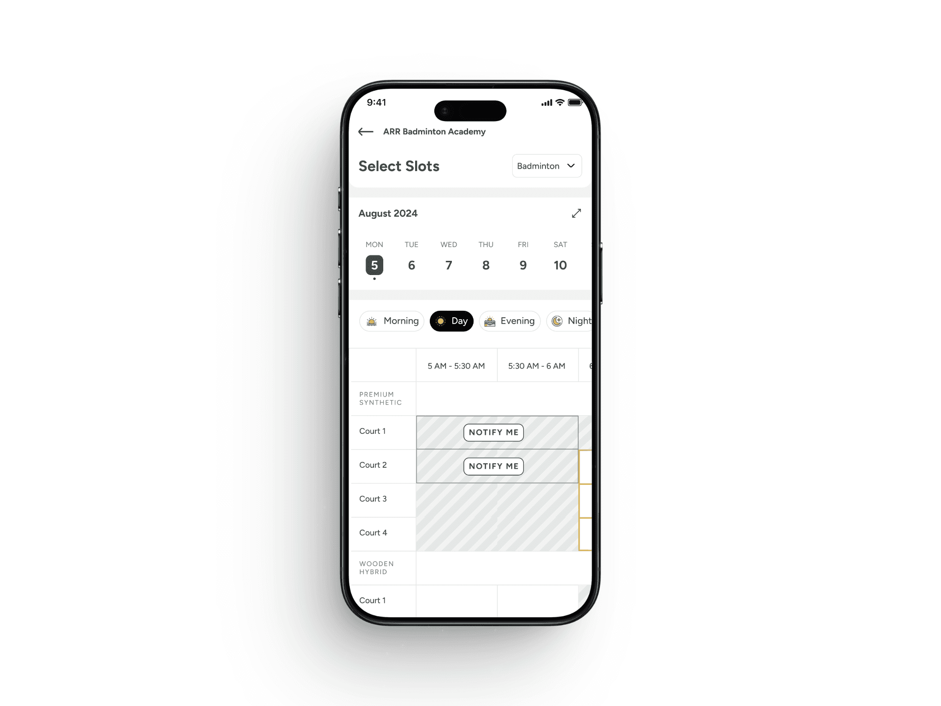
Direction B — Time-of-Day Filters
Direction B — Time-of-Day Filters
REJECTED
REJECTED
The time filters helped reduce visual density, but didn't solve the underlying problem — users still had to do the math of duration vs. end-time. We were treating a symptom (too many slots) instead of the root cause (cognitive load of time calculation).
The time filters helped reduce visual density, but didn't solve the underlying problem — users still had to do the math of duration vs. end-time. We were treating a symptom (too many slots) instead of the root cause (cognitive load of time calculation).
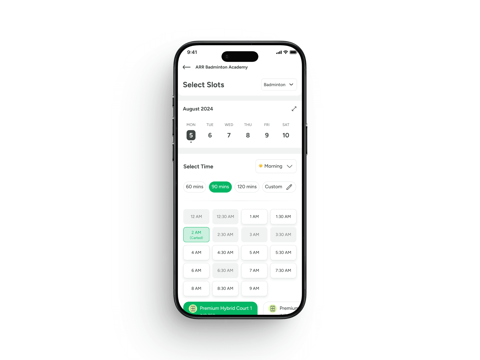
Direction C — Dual Pointer Timeline
SHIPPED
SHIPPED
We kept coming back to one core insight: users don't want to think about time — they want to set it and move on. The dual-pointer timeline made the start and end of a session physically visible and adjustable, removing the math entirely.
We kept coming back to one core insight: users don't want to think about time — they want to set it and move on. The dual-pointer timeline made the start and end of a session physically visible and adjustable, removing the math entirely.
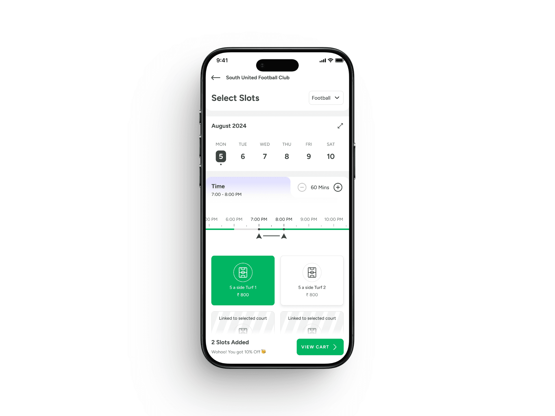
The Six Principles That Shaped the Redesign
The Six Principles That Shaped the Redesign
The final redesign wasn't a single creative leap — it was the disciplined application of six principles, each tied directly to a diagnosed pain point.
The final redesign wasn't a single creative leap — it was the disciplined application of six principles, each tied directly to a diagnosed pain point.
01
Dual Pointer — Remove the math
Two adjustable handles (start + end) instead of a single drag point. Users see exactly when their session begins and ends. No mental arithmetic required.
Two adjustable handles (start + end) instead of a single drag point. Users see exactly when their session begins and ends. No mental arithmetic required.
02
Live Visual Feedback — Show, don't tell
As users drag the pointers, the selected range highlights in real time on the timeline. Start and end times update live in the time display.
As users drag the pointers, the selected range highlights in real time on the timeline. Start and end times update live in the time display.
03
Transparent Pricing — No checkout surprises
Court selection now shows pricing upfront, per court, clearly labeled. By the time the user reaches checkout, the number is already familiar — not a surprise.
04
Reward-Style Coupons — Make redemption feel earned
Converted the loyalty system into a reward-style coupon mechanic. Coupons became visible, satisfying to redeem, and gave users a reason to complete a booking they might have abandoned.
05
Cart Preview — Confirm before commit
Added a slot summary visible at the bottom of the slot selection screen. Users can verify their slots, courts, and pricing before tapping checkout — preventing wrong bookings at the source.
06
Smart Alerts — Catch errors before they happen
Modals that intercept common mistakes: 'This slot has already started — Add Anyway?' and 'Current venue full — Explore Venues Nearby.' Errors become teachable moments, not dead ends.
03
Transparent Pricing — No checkout surprises
Court selection now shows pricing upfront, per court, clearly labeled. By the time the user reaches checkout, the number is already familiar — not a surprise.
04
Reward-Style Coupons — Make redemption feel earned
Converted the loyalty system into a reward-style coupon mechanic. Coupons became visible, satisfying to redeem, and gave users a reason to complete a booking they might have abandoned.
Converted the loyalty system into a reward-style coupon mechanic. Coupons became visible, satisfying to redeem, and gave users a reason to complete a booking they might have abandoned.
05
Cart Preview — Confirm before commit
Added a slot summary visible at the bottom of the slot selection screen. Users can verify their slots, courts, and pricing before tapping checkout — preventing wrong bookings at the source.
Added a slot summary visible at the bottom of the slot selection screen. Users can verify their slots, courts, and pricing before tapping checkout — preventing wrong bookings at the source.
06
Smart Alerts — Catch errors before they happen
Modals that intercept common mistakes: 'This slot has already started — Add Anyway?' and 'Current venue full — Explore Venues Nearby.' Errors become teachable moments, not dead ends.
Modals that intercept common mistakes: 'This slot has already started — Add Anyway?' and 'Current venue full — Explore Venues Nearby.' Errors become teachable moments, not dead ends.
What We Measured
What We Measured
We didn't ship and hope. We tracked a specific set of metrics to validate whether the redesign actually worked — and we set the baselines before launch so we could measure honestly.
We didn't ship and hope. We tracked a specific set of metrics to validate whether the redesign actually worked — and we set the baselines before launch so we could measure honestly.
Online GTV
Online GTV
the direct revenue number, tracked monthly
the direct revenue number, tracked monthly
the direct revenue number, tracked monthly
Funnel drop-offs across every step
Funnel drop-offs across every step
Venue → Slot → Checkout → Charged
Venue → Slot → Checkout → Charged
Venue → Slot → Checkout → Charged
Charged conversion rate (paid bookings)
Charged conversion rate (paid bookings)
the bottom-line metric
the bottom-line metric
the bottom-line metric
Transacting users growth
Transacting users growth
a proxy for funnel health
a proxy for funnel health
a proxy for funnel health
Karma Points + venue coupon redemption rate
Karma Points + venue coupon redemption rate
to measure the loyalty system's success
to measure the loyalty system's success
to measure the loyalty system's success
Experiment Setup
The redesigned experience was validated through an A/B experiment over 200K active users, split evenly between a control group on the existing booking flow and a variant on the redesigned flow. The experiment ran over 4 weeks.
The redesigned experience was validated through an A/B experiment over 200K active users, split evenly between a control group on the existing booking flow and a variant on the redesigned flow. The experiment ran over 4 weeks.
The Impact
The Impact
Headline numbers tell one part of the story. Behavioural change tells the rest.
Headline numbers tell one part of the story. Behavioural change tells the rest.
Headline Wins
Headline Wins
Online GTV — the most direct measure of business value — was the metric that mattered most. Here's how it moved:
Online GTV — the most direct measure of business value — was the metric that mattered most. Here's how it moved:
₹42L → ₹50L
₹42L → ₹50L
Monthly online GTV (+19% in 2 months)
Monthly online GTV (+19% in 2 months)
+28.7%
+28.7%
Charged conversion lift
Charged conversion lift
+36%
+36%
Transacting users
Transacting users
+9.41pp
+9.41pp
Charged funnel rate (32.77% → 42.18%)
Charged funnel rate (32.77% → 42.18%)
+20%
+20%
Loyalty redemption (Karma + coupons)
Loyalty redemption (Karma + coupons)
What We Learned After Launch
What We Learned After Launch
No redesign is perfect on day one. After launch, we continued watching the data and listening. The best post-launch tweaks are the ones that feel like they should have been there from the start.
No redesign is perfect on day one. After launch, we continued watching the data and listening. The best post-launch tweaks are the ones that feel like they should have been there from the start.
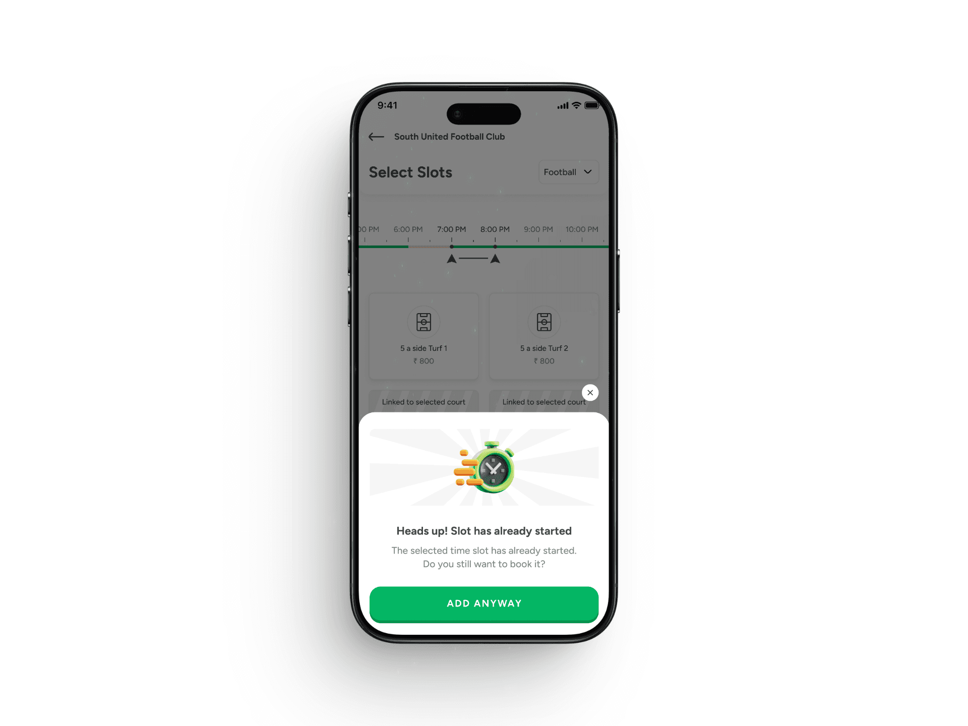
Tweak 1 — Smart Alert for Past Time Slots
Tweak 1 — Smart Alert for Past Time Slots
We thought: users would never pick a slot that had already started. The data showed: some did, especially on busy weekends when they panicked-tapped. So we shipped: a modal — 'Heads up! Slot has already started' with a clear 'Add Anyway' button. The result was an immediate drop in support tickets about already-started slot bookings.
We thought: users would never pick a slot that had already started. The data showed: some did, especially on busy weekends when they panicked-tapped. So we shipped: a modal — 'Heads up! Slot has already started' with a clear 'Add Anyway' button. The result was an immediate drop in support tickets about already-started slot bookings.
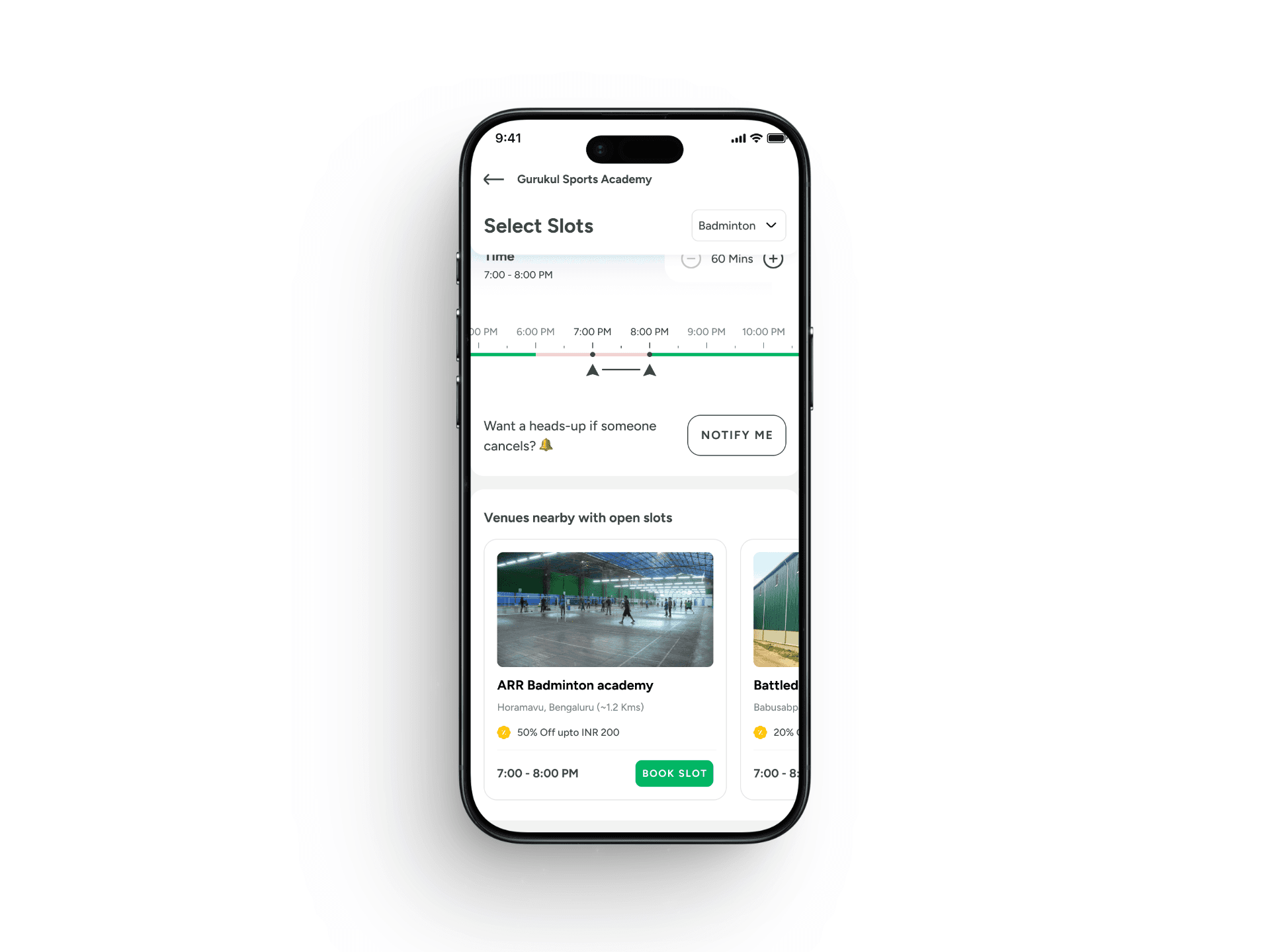
Tweak 2 — 'Venues Nearby' when current venue is full
Tweak 2 — 'Venues Nearby' when current venue is full
We thought: when a venue is fully booked, users would naturally retry at a different venue. The data showed: most just dropped off entirely. So we shipped: a 'Venues Nearby' option that appears when the current venue is full, showing alternative venues with available slots at the same time. Hosts at the alternative venues started seeing incremental fill, and we converted a dead-end state into a continuation path.
We thought: when a venue is fully booked, users would naturally retry at a different venue. The data showed: most just dropped off entirely. So we shipped: a 'Venues Nearby' option that appears when the current venue is full, showing alternative venues with available slots at the same time. Hosts at the alternative venues started seeing incremental fill, and we converted a dead-end state into a continuation path.
See Similar Projects
See Similar Projects
Want to get in touch? I'd love to connect with you!
Want to get in touch? I'd love to connect with you!
Always up for collaborations, conversations, or maybe even a game
Always up for collaborations, conversations, or maybe even a game
jithinpankaj@gmail.com
Click to copy
Copied!
jithinpankaj@gmail.com
Click to copy
Copied!